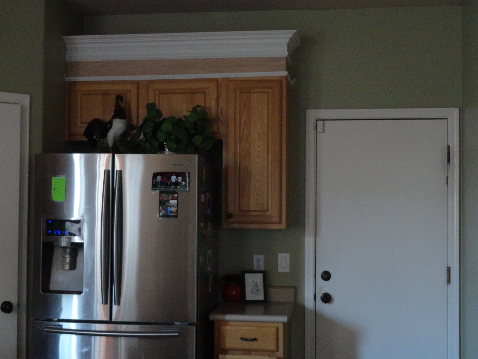
Before Dw and the June 2013 IVO GO Team left for Africa
Dw had been working a bit here and a bit there
on the kitchen….
It’s coming along beautifully…
We are trying three different colors on the doors…
The left is a bit lighter version of
Summer White,
called
Restful White
**
The center is the deepest tone of the three –
kind of a creamy yellow tone
called
Summer White
**
The far right is the most bright white
{with a teeny-tiny tad of a yellowy tinge that is
not visible other than the guy at the paint store
said it has yellow in it}
It’s called
Westhighlander White
**
{They only make the little samples
in a eggshell finish, so they look a tad dull.}
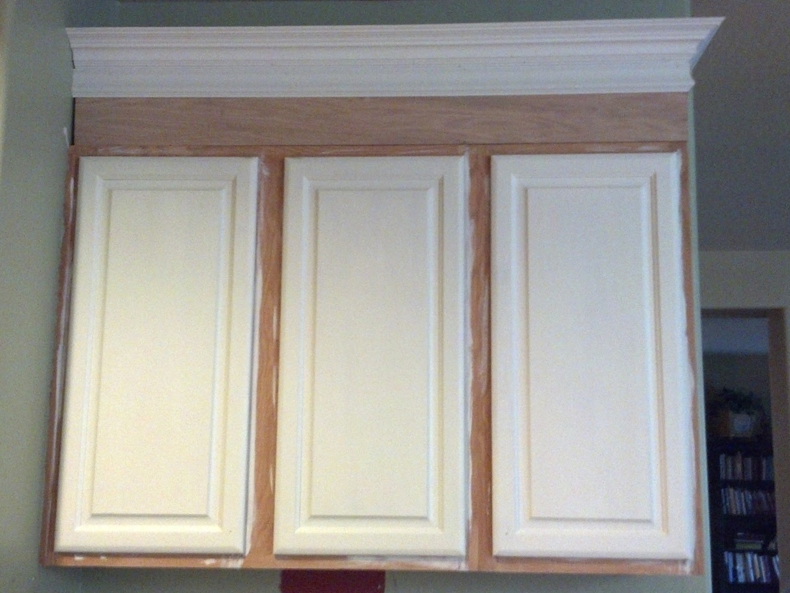
Can you tell a difference?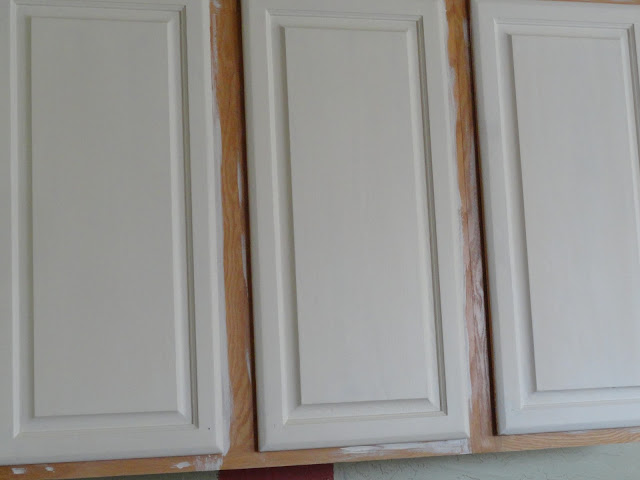
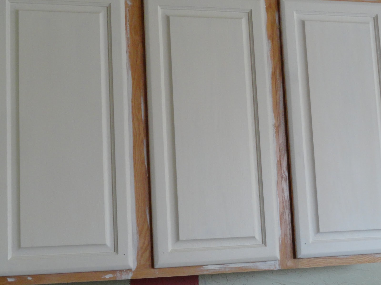
It’s hard to capture the three colors accurately with the lighting
in our kitchen and the camera I own.
I do know which one I like best.
Any thoughts?
There is not much difference between the first two online –the middle is a bit darker anyway….but the third is lighter. Is your kitchen going to be lack and white still? Which would blend with that?
I am no good at this as I like everything to b l e n d……m a t c h…..Drives my girls crazy!
It is really hard to show the true colors on line. The right is more like a stark white. The middle is definitely more like a yellow. I look at Hallmark movies with white cabinets and wonder what kind of white it really is? We had stark white once upon a time when we pastored in NC and VA…
I like the middle one. It feels warmer than the one on the right, and I like the depth of it better than the one on the left.
The middle one is really pretty and it is definitely warmer than the outer two.
I like the one on the left. It is very crisp looking. How do you get so much accomplished with the little ones is really what I was wondering. You go girl.
Left or middle. Just my opinion. 🙂
I would be the worst person to ask lol. They all look the same to me o_O I am sure that they are all nice though. Based on the written description, I would go with the middle one. I should have David, dh, look at them. I am sure he'd be able to pick out the difference really quick with an opinion. Anyways, happy for you that you are getting a renovation on your kitchen. I hope that one day we won't be renting any longer and can do that kind of fun stuff. However, for now, we are happy with what God has blessed us with and will continue to be until He moves us.
Next to the green the left looks really yellow. I like the middle and last one. We live in the rainy part of the world so I like bright and warm inside because it's dark and gray most of the time outside! We have "honey pot yellow" in our kitchen!
The one in the middle is the best choice…it picks up the warm undertones in the wall color 🙂
I'd match the counter tops and lighter color in the floor so it didn't clash. Just my two cents
The darker one may not go with the black island and the silver fridge? Sorry for three posts. I kept making mistakes and in trying to fix would hit publish instead of preview!:)
Blessings and have fun decorating! It will be beautiful!
hollym.:)
I would stick with either of the outer two. Yellowish white is more outdated. Just my humble opinion. ;). Who knew there were so many shades of white!!! I painted mine last summer and colored the bottom ones a grayish green color because we had springy green counters we could not replace at this time. I really love the look!! Let me know if you want to see.
FYI we will hopefully be traveling within a month to pick up our boys from the Congo!!
It's definitely hard to tell the difference online, but with the lovely green walls, I would pick the brightest white, all the way on the right. 🙂 But that's just me. Love getting to see things step by step!
I was desperately trying to see the color of the counters… that would be my deciding factor. The middle one is my favorite with the green on the walls. If the counters are kind of white, I might go with the purer one on the right. :o)
I like the far right
I agree middle pic.
I'd go for the far right. I like it! 🙂
Oh, go for the one on the right. It's pretty! 🙂